Task
Designing the essential icons for this open-source project.
-
Strategy
UI/UX Design
-
Design
UI/UX Design, Icon Design
-
Client
Wis.design
Project Background
Wis Design is a front-end UI framework based on React, with the vision of providing a consistent and seamless user experience across different devices and platforms.
I was responsible for designing the essential icons for this open-source project.
Project Goals
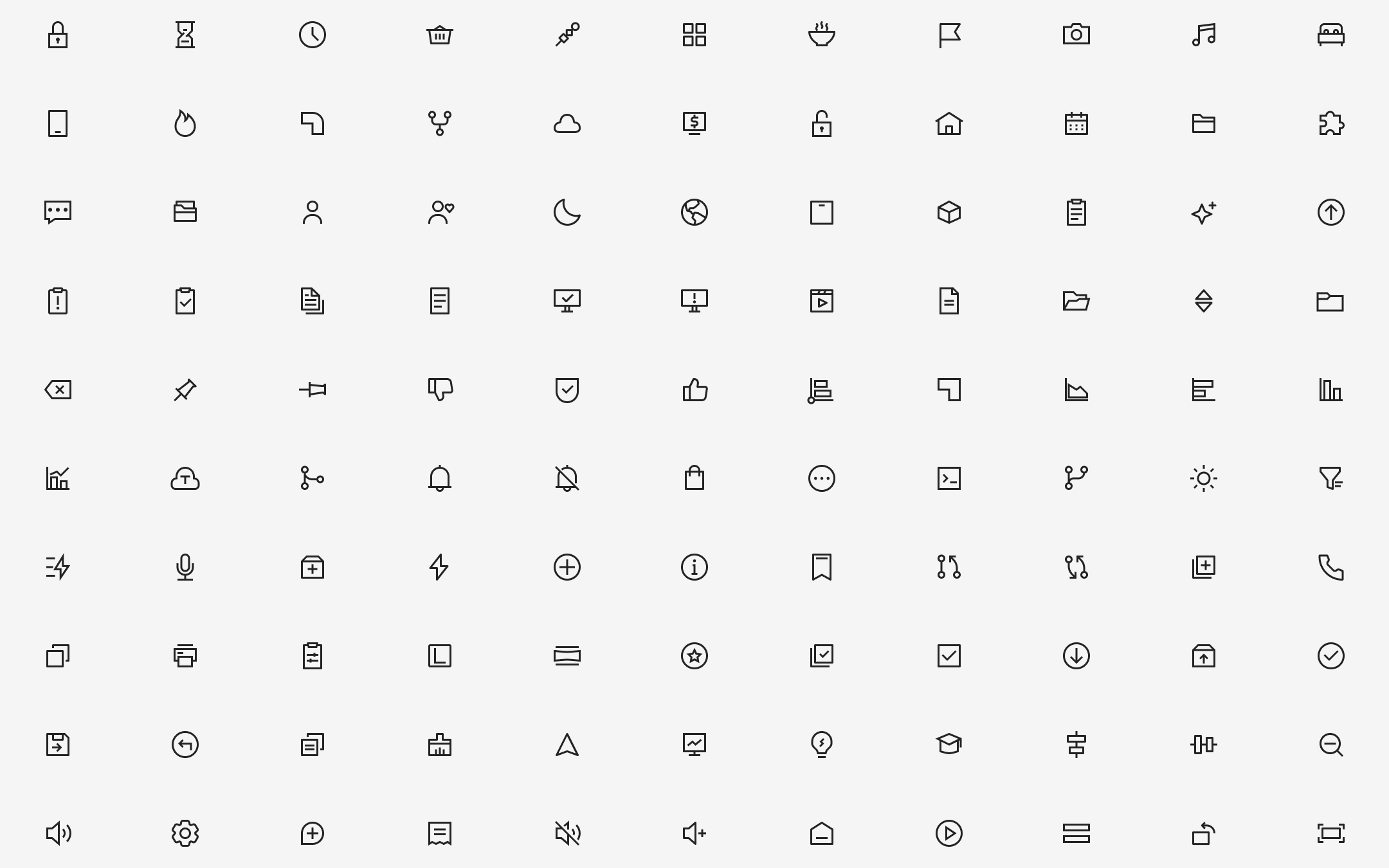
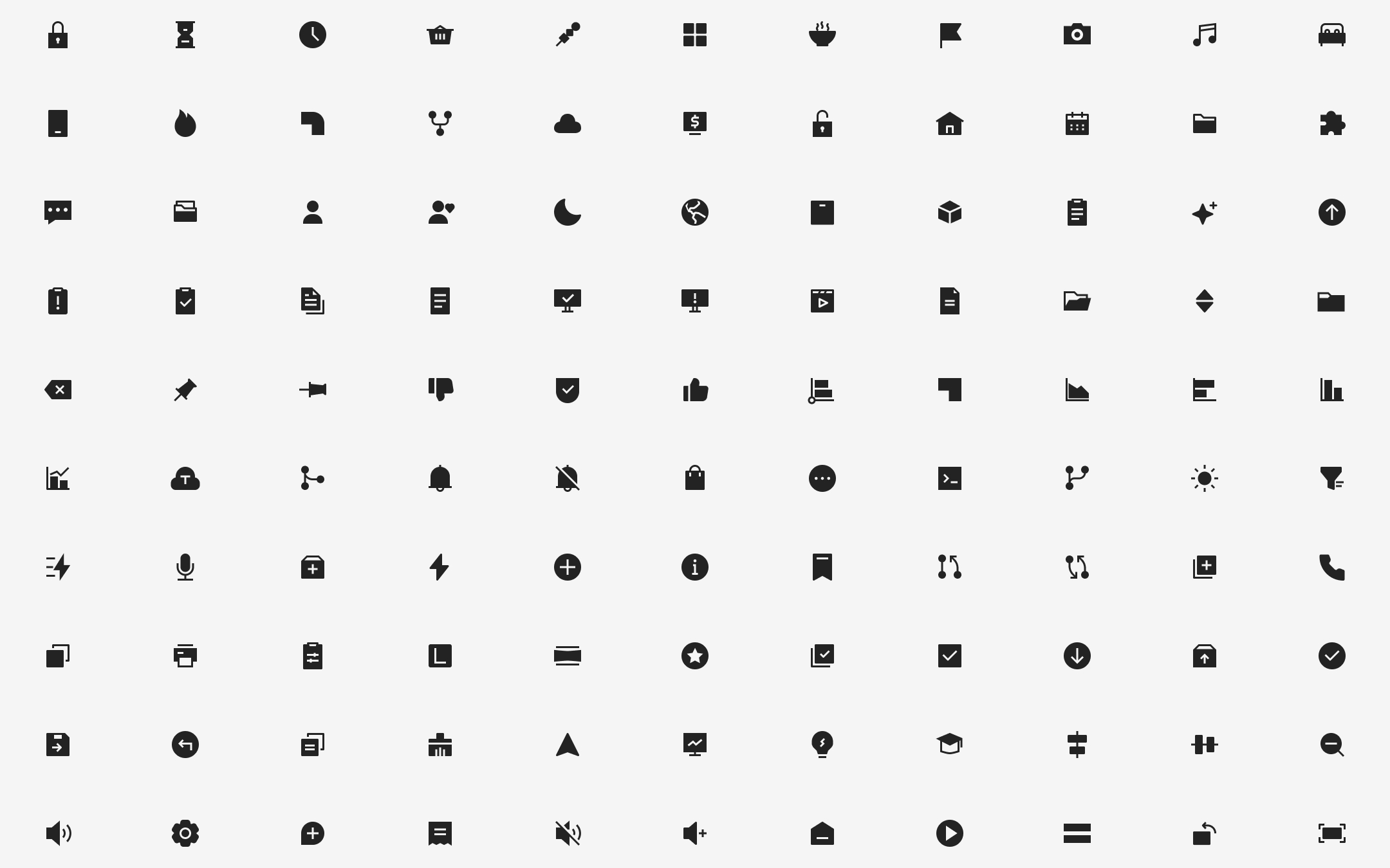
- Design over 700 icons, available in both linear and filled styles.
- Create a landing page that allows for the visual adjustment of icon parameters.
- Provide the open-source Figma design files.
- Establish an efficient icon delivery process.
Design Process
1. Analysis and Research
After analyzing the requirements, the decision was made to use the SVG format, supporting both linear and filled styles.
2. Icon Design Standards
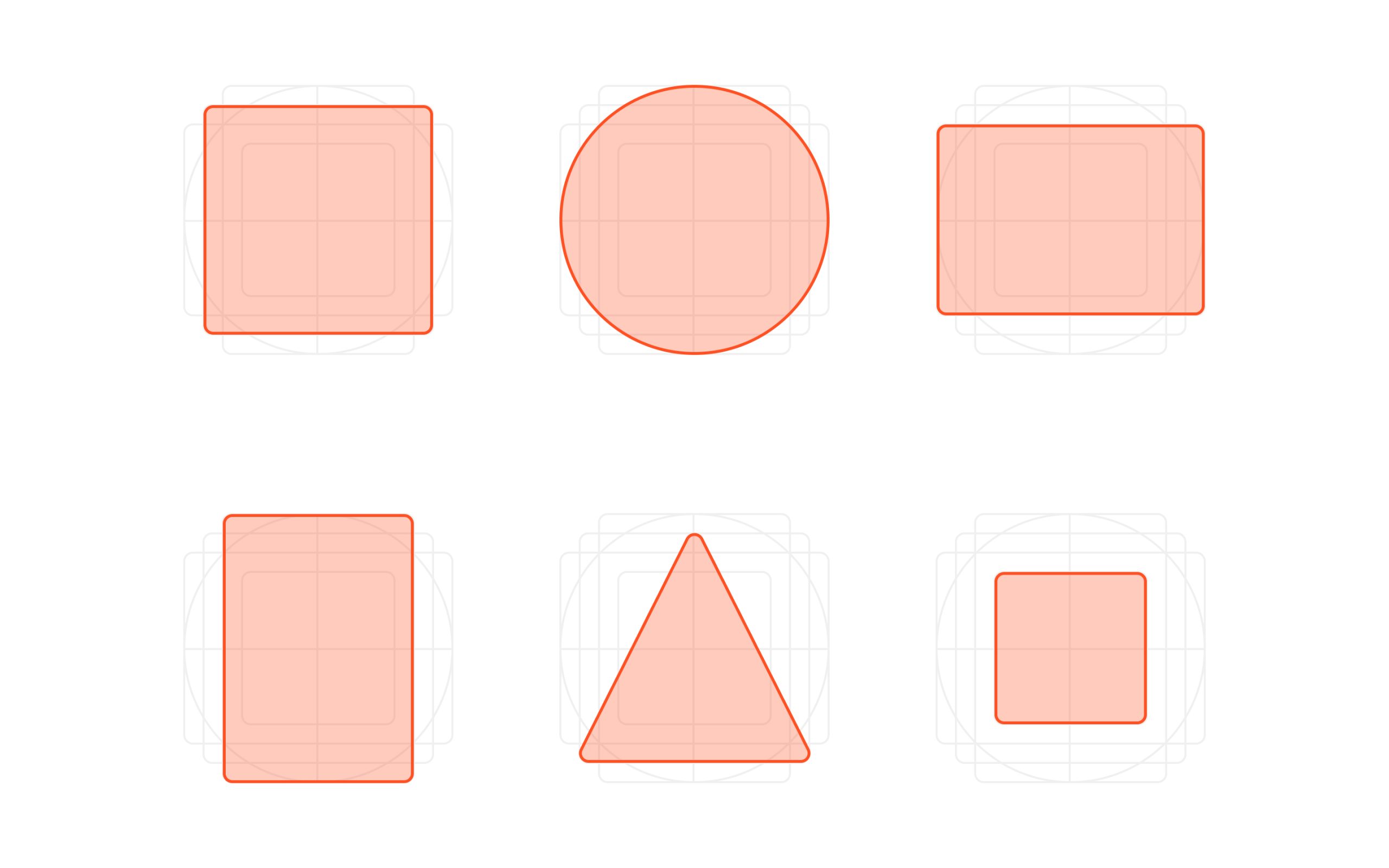
Icon Grid Construction: A grid system was created using six basic geometric shapes—square, circle, wide rectangle, tall rectangle, triangle, and small square—as the foundation for all icon designs.
![]()
Drawing Rules:
- Stroke width: 1px
- Stroke alignment: Centered
- Stroke color: #000 (black)
- Node type: Rounded corners, with sharp corners at breakpoints
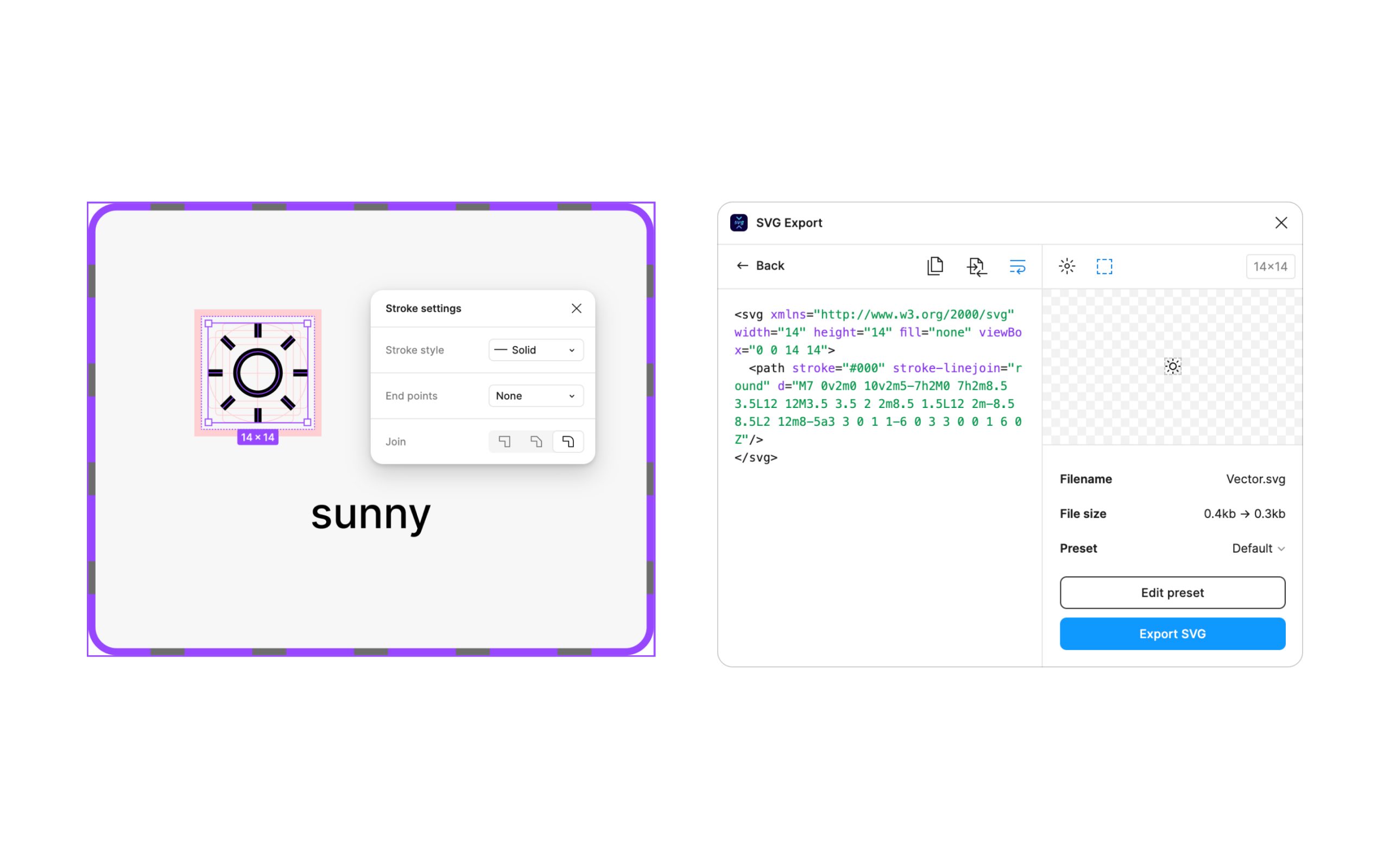
Post-Design Adjustments: Once the icons were drawn, the “Join All Paths” function was used to merge the shapes while retaining the original paths.
4. Icon Resource Delivery
- Figma was used to design the icons, organizing them into a single component for easy management.
- A build process in the front-end project was set up to automatically pull the icons from Figma.
- The final icons were delivered via pnpm for easy integration.
Design Highlights
- Open-Source & Free: The icon set is open-source and free for anyone to use and contribute to.
- Easy Integration: Designed for smooth integration with web projects, particularly with React-based applications.
- Customization: The icons support easy customization, including adjustable stroke widths and colors, making them flexible for different use cases.
Project Outcome
Icon Design Pack: The complete icon set was published on the Figma community
Icon Development Resources: The icons were also published on npm for easy integration in React projects.
Included in the iconify.design platform: All popular icon sets, one framework(icon-sets.iconify.design/lsicon/)

